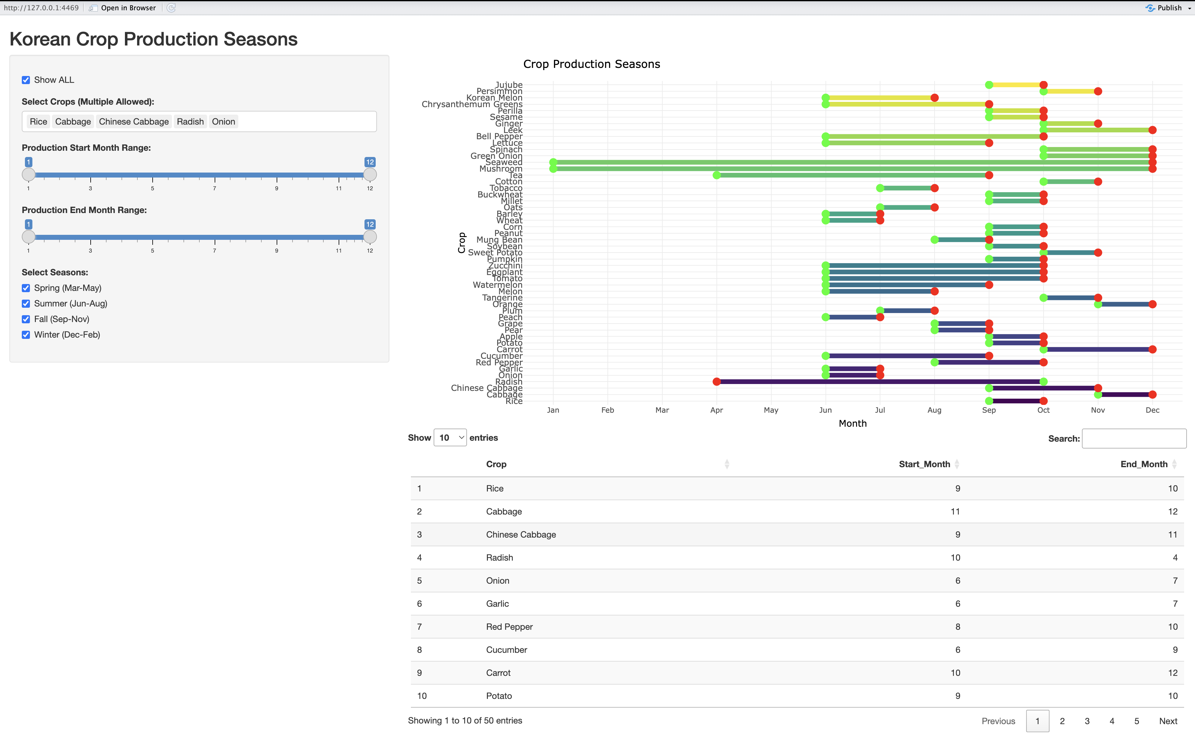
Interactive Shiny Dashboard for Crop Seasonality
This Shiny app visualizes Korean crop production seasons using interactive filters for crops, months, and seasons, displaying results with Plotly segments and a data table, built with R, dplyr, and ggplot2.
Purpose
Visualize and filter crop production seasons interactively.
Statistical Techniques
- Data filtering (Narrows dataset by user inputs; crop/month/season selection)
- Visualization with segments (Shows production timelines; maps start/end months)
- Reactive data processing (Updates outputs dynamically; real-time user choices)
Output
- Interactive Plotly chart and data table of crop seasons